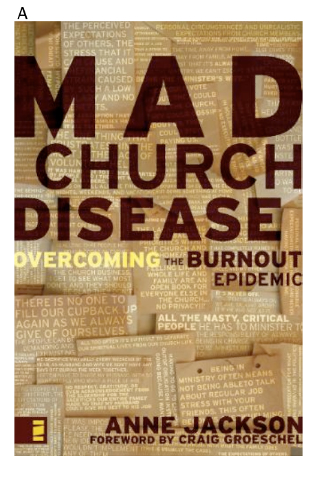
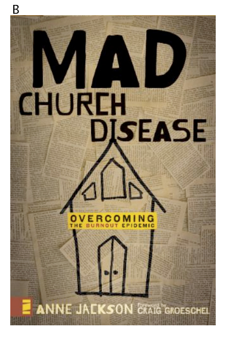
as i’ve said before, this whole book writing process has been fun because of the input you all have. so, after having some initial chats about direction and look and feel for the book, they have landed on two concepts.
these are the drafts, and as such i need to explain a little bit.
the words behind the title are true (but anonymous) stories that people submitted through the mad church disease website during the month the surveys were open. this is how people REALLY feel.
in the first image (A), these are reversed out from the texture. in the second image (B), what the plan will be is to print out the chosen pieces of the stories (and change their font/type size, etc. to make some stand out) and use a photograph of that behind the illustration. currently it is just a similar photograph of bible verses. but, you get the idea!
the marketing and creative directors and i have already talked through these with a few opinions from some lifechurch.tv staff, my agent, and some friends. so we kind of already have a “gut” feeling and some thoughts on changes…but this is where you get to help confirm us (or scare us in another direction!)
what do you think? what do you like? not like? what would you change?
would love to hear your thoughts!!
Comments
207 responses to “INPUT WANTED ON MAD CHURCH DISEASE COVER ART!”
i like B, mostly because the title and subject line are easier to see and read. the text behind on A kind of distracts me from the title and subject.
I like “A”. Probably because I’m getting more conservative with my taste in my old age. :)
It feels like I can take A more seriously than B. There is some appeal to me for the simple feel of B, but after starting at these for 60 seconds and asking my 3 year old son, who is next to me, we both agree…A will sell a bazillion copies. And that’s a lot of copies.
P.S. Tyler is easily distracted. ;) You know those Presbyterians…
i like the premise of B, but i love color and it is pretty “colorless” too bad you couldn’t do it on “post it” notes. but then that would kindof defeat the purpose. is mad church disease a black and white issue or are there many shades to it? they are both creative, but i think i like A better.
chuck
at first, i liked A, but i see what Tyler is saying about the distractions. i like the boldness of the title & subject of A mainly.
I think if the type for A was strengthened, that would be your winner. The layers of text help to personalize the subject matter, and also give a contextual foundation for what the book will be about. I look at the cover and know what it’s about immediately.
Solely based upon cover…if I had no idea who you were, or what this book was about…
If I saw both of those in the bookstore, just based upon the cover, I would buy B.
I way prefer A. It looks more professional and I like that you can read some of the comments on the paper in that one.
I like the first one much better. But I have a question–is this book aimed primarily at pastors? That’s been my sense of it from reading your blog. But if it is, I don’t think that’s clear from the book cover–particularly the subtitle. Maybe the word pastor needs to be in there somewhere (pastoral burnout). If it’s not just for pastors, then the clips they’ve chosen are confusing because they all seem to be about pastor’s issues.
I like A best. It’s more appealing and I can read the notes. On B, the notes aren’t so legible and, so, don’t make sense why they’re part of the design.
And by type, I meant to say the type for the title treatment, not the background type.
I have to say, I was a little surprised when you sent a tweet about this, because I thought the icon I see everywhere about it (and on your blog to the left) WAS the cover design. Of the two above, I like A because I can read the notes behind it.
BUT, I actually like the cigarette design the best. There’s the subconscious link in the cigarette design to disease/bad health, and that’s exactly what you’re trying to convey.
So I vote for C. :-)
I actually like the fonts used for A but prefer the B background (A’s background is distracting). If you could put the A fonts on the B background that’d be the winner (to me).
A appeals to me more because I like the clean lines of it versus the drawing on B.
B
I too like “A.” I like the way the confessions are treated better and I think it looks more “grown up.” The font in number two looks childish. Maybe there’s a concept behind using a different font for each letter and I’m just missing it.
That said, I think like the original artwork better. I think it would jump off the shelf to me more than either of these options.
‘A’ feels big. Like someone standing with their arms outstretched making a declaration. Extroverted
‘B’ feels withdrawn. Like someone pulling everything in on themselves. Introverted.
Print out two actual sized images of the book. Go to a book store and put them on a shelf, facing the aisle. Turn your back, wait a couple of breaths, then turn around. Which one catches your eye first? I would go with that one.
I will go with A. I just like the way it looks better.
I like the background for “A” and the rest of the design from “B” – the little pieces of paper with words on them in “A” are a lot of what I hear as a pastor…
I like the background of A but i like the rest of B….the church on B is really cool….but i like the back of A because it speaks about what the book is about and gets you intrigued.
my humble opinion
I like b
I too thought the original logo was the cover…So, without that, I choose A. It looks more, “professional”?
Just my opinion…
I like A better and the fact that I can read the stories in A better than B.
B just looks a little too juvenile to me for the seriousness of the subject matter. A looks good – can’t say I find anything wrong there at all. I agree that that something more specific is needed in the title – perhaps “Overcoming The Church Staff Burnout Epidemic” etc.(that sounds really too wordy, but you know what I mean.) I’m not sure I’d use the word “pastors” as (I assume) this book applies to so many beyond/below the pastoral role.
“a” has a warmer feeling and pulls me in.
My vote is for B if you can make any changes, put the background of A in B.
I like A, it is easier to read. B looks a bit childish to me. But whatever you chose to go with will be great!
Hate to be a downer, but both of them pretty much make me say, “meh, whatever.”
You’re original design was WAY better. I think it should be used because there’s already branding and recognition all over the internet-churchy community.
But, if I had to pick one, I’d go with A. Still makes me say “meh, whatever.”
A seems cool. Love to see them work a bit more on the fonts though. Just doesn’t seem mad churchy enough (if that’s a word!).
May want (fonts) to hone in a bit on how burnout (and crazy) people may feel.
May want to see if they can play a bit on the Indiana Jones / Andy Stanley’s It Came From Within font style. May work…either way (I’m buying it!)
Out of those two, definitely A. B looks pre-schoolish to me. Like the house on Blue’s Clues or something. I did like your original promo cover a lot though too! I take it you can’t use that?
I prefer A. Red reflects the ideas and concepts implied in the title. The church might be a little to literal. I’m even more interested to read the pages behind the cover. :)
A
the color pallet for ‘A’ is appealing and compelling, whereas ‘B’ is very drab and withdrawn feeling.
and the words for ‘A’ that are seemingly illuminated make me feel like they’re words or thoughts that I might have verses reading words/thoughts on ‘B’ that others have said (does that make sense?). plus, there is no connection (to me anyway) for the newspaper clippings in ‘B’.
my vote is for ‘A’.
it’s much cleaner and bolder with a modern classic-ness that will visually appeal to a broader audience.
I like “A” a lot!
and perhaps you might thing of the original logo/brand badged somewhere on the cover?
#2
Of the two, I’d choose A. But my first choice would be the one that looks like a pack of cigarettes.
B … i know the submissions were all online, but it might be cool if for the cover some were typed and some were handwritten … giving variety and texture to the paper and the words. thanks for asking!
hmmm…
Anne, I’ll be 100% honest. I don’t like either. Sorry. :)
What happened to the Mad Church Disease look and feel of the website? I liked that look…
Comment #2. Of the two choices given I think I’d pick A.
I like “A” best. I think it just looks stronger.
I like B.
I prefer A – agreeing that it looks more definite – a book to catch your eye on the shelves or at Amazon.com
Man, they are close, but I’m thinking “B”. “A” looks just like what a church book should look like. I like it, but I like “B” more – it’s more appealing and less “threatening”, if that makes sense.
I definitely like A.
Rally for the original design!
OD in the house~!
(I’m buying it either way…)
A is cleaner looking. And I like reading the quotes. I like it.
Can’t wait to read it.
You need some reviewers? I’d love to review it.
A – all the way. It’s impactful and you can read the true statements much clearer.
Option B looks like a sesame street drawing – not “real” enough. This is an important and very deep subject…child-like art doesn’t get that point across.
B. B. B. B. BBBBBBBBBB.
Powerful in its simplicity.
I would overlook the first one on a shelf…but B would draw me in.
B for shizzle
I like A because it had good quotes to read on the cover – If I were in a bookstore, I would read those and that would make me want to open it up to see what’s inside.
A – I think it works better and looks more aesthetically pleasing to the crowd you’re directing the book too. It looks professional but fun/insightful/thought provoking at the same time. Being able to read the quotes in the background is also really interesting and would make me more interested in reading the book after seeing what they say.
cheers!
I like the background papers of A better in terms of colour/style…Awesome! …the foreground lettering is a little “the-same-as-other-contemporary books”… as has been alluded to in other comments… which is why I like the potential of the foreground graphic/lettering in B, just because it’s different (I might cross the letter I, though, to make it more obviously the cross on the church steeple – ties in the drawing with the text as a visual cue – otherwise feels to me that the church drawing is squished awkwardly close to the text). I say potential because I wouldn’t necessarily go with it in it’s current form – maybe needs a little work – which of course I may have some ideas about. :)
from my email to you yesterday, “oh, i like them both too, but on initial glance, i like the second better. less cluttered, making the title, subtitle and your name easier to read. i look at it from this angle: to look at the title itself, its somewhat difficult to know what the book is about. the subtitle is important, so if it is lost in the design of the cover, then what good is it? the subtitle standing on its own in the brightness of the yellow box brings it out. i also like the old school church.
however, i prefer the bolder colors of the first. are you able to combine elements of both a bit?”
I like the clean look of A :)
I’m with a few of the others who say that neither promote a WOW reaction. First one looks professional, but stuffy. In the second one I keep seeing newspaper clippings strewn about – like for a puppy in training.
B is very cool. I think it would definitely catch the eye…
I think “B” is more aesthetically pleasing. “A” looks a little too loud and jumbled to me.
I like A. It looks real whereas the words in B look like newspaper clippings.
I think that men will gravitate more easily towards A, it has a more masculine look.
B…
The only change that may make it stand out more is to replace the black title lettering with the burgundy color from A.
A – i hear dislike for it due to distracting, clutter, jumbled…how life is for those who suffer from the disease???
i like how the title JUMPS out at you on the distracting, cluttered, jumbled cover!!!
throw in a cup of coffee spilled over on the notes…and it’s off the hoooooook!
b
I think both covers are great. The first looks more like something I would pick up relative to the word “disease” – bold use of type; however, I might be more intrigued by the 2nd cover because of the design.
I’m on the fence.
A
I’m used to seeing the green one (on the left side of the website- the original cover)
I like B better because it just “grabbed me” when I saw it. However, after closer inspection, I like the wording topics of the pages in the background on the A cover. I’m excited to read this! :)
i like the first one alot!
I like A. The lettering on B seems a bit childish, I might not pick it up off the shelf. A has a more serious feel to me.
I like cover A
I think jon got it right – A is awesome. The title stands out, but the background is overwhelming – distracting. Subliminally, and conciously, it visually represents the often cluttered, overwhelming and chaotic life of the target demographic – ministry people – without losing coherence or meaning. Plus – it sets a good brand standard for a pretty nifty website.
Overall, I mostly like A. Colors are great, and the little snippets give me a good feel for what will be inside of the book.
B is too plain… if you go that route,can they color it like A, especially the letters… and not try to use the I as a cross on top of the church?
I think I’m gonna have to go with B.
I’m actually surprised Anne. You’ve built a brand with the original bug and now you’re chucking it? Is this the art department’s idea?
I like that I can see the stories in the background on A, but I like the church drawing on B
I like A – it is eyecatching and looks a little “burned” at the edges.
A.
A
A
Add me to the list that thought the icon was the cover. Is that even still a consideration?
Of the two, I also agree with the lot that the color scheme of A is so much more appealing.
definately a vote for A from me
I like A, though i kinda think ‘overcoming’ needs a stroke around it in the same color as the other text with about 60% opacity, so its more visible but not too distinct! I do like both though but mmmmm yea A
Anne,
I think that “A” is what I’m drawn to the most. When I see certain book covers like A I would buy it right away. The tan background and different size font with Red Title gets me to buy. And plus I love your writing so why wouldn’t I buy it.
i vote for B, but that is because that type of imagery grabs me.
B. it portrays a little more madness. not all together. less polished like it really is beneath the surface.
i like A it’s more interesting. B looks a little childish.
A
A. Definitely A. As others have commented, it causes me to take the subject matter more seriously.
In fact, I like the busy-ness of the background. It’s like hearing all of these voices in a crowded room, which to me reflects the mental fatigue and “background noise” of the demands of ministry when I get close to burnout.
to further expand on the spilled coffee idea from my earlier post…this is due to the disgust being felt over the disease…
thanks josh for your vote of agreement!
I like B a lot better. I agree with the comment above that says A is what a church book ought to look like. Typical, professional, too safe for me. However, I guess it depends what crowd you are trying to reach.
I like the use of stories behind the text/picture and the idea of different fonts, sizes on B.
Just my two cents…
You are doing an awesome job with getting this much-needed book out there.
(by the way… I like the original MCD look on your blog a lot too)
“Yep, you know me. All I am out to do is get heated comments and sell books. I am so busted”
bussted, again!
yep. heaven forbid i actually care what you all think!
sigh, tony. sigh.
Anne – NEVER take any little dig from me seriously. I know it doesnt’ bother you in the least but it’s just in fun – you’re great and I hope you make millions on your books!
Plus – it’s your blog, you can do anyhting you want to!
BTW – I like choice C
:)
A-I want to read
B-didn’t draw me in at all.
The words “all the nasty critical people’ really drew me in.
(my 2 cents:)
I’m liking A
oh yeah. do you have a chapter or chapters on dealing with church finances? if not, maybe in your next book :-)
Three emailed in votes for
A
A
A
and one and half for the old design!
I like “A”. It caught my eye a lot better than “B”… AND I love how it caught me there reading the background :)
Maybe it’s because I’m used to it, but I like the one in the sidebar the best…
Between A and B, though, I prefer A.
Can I have do-overs? After reading the other posts, I will say what I probably should have said the first time. I really like the original artwork. You’ve already got a recognizable brand out there… not to mention lots of nifty web banners on lots of blog pages. To change now might shift the momentum for an unwanted outcome. The original art is very eye-catching and I like it a lot. Just like AT&T should have probably built on the Cingular mark vs. theirs, you should go with what you’ve had. This is a crazy and possibly more expensive idea, but what if you used your original artwork printed on a clear plastic cover (maybe slightly opaque) and have the next “inner cover shell pages” have the hand written words from comments you received. That might make a nice mash-up between the new ideas and the original, highly recognizable art. Plus, it would be a VERY COOL cover…. being see-through and all….
I like what you originally had… just sayin’…
But between these two, I like the IDEA of A; but it needs a good bit of tweaking to make it more interesting. Someone else above said it, but if I didn’t know what the book was about/hadn’t heard of it, and I saw it on a shelf, I’d probably pass over the two as they are.
I am totally a “judge a book by its cover” kind of gal when it comes to choosing a book to read.
Blessings,
K
I’ll take B for 1000. It grabs my attention more on initial look BUT, on a second glance, the writings in A pull me in as well.
A – easier on the eyes
What’s wrong with the original green one?
Ok. The original one I LOVE. AND Joey is awesome (the guy who designed it). But because it looks so much like Lucky Strike, it could possibly be considered as infringement.
Sorry!
I like A best mainly because of the highlighted words of the written notes. That is something I can’t tell anything about on B.
One of the things I loved about your original logo was the absolute boldness of it, yet it was a little messy too, not too clean. Anyway to incorporate bolder colors and messier graphics? That echos the out of control feeling you get on your way to burning out!
I like A. I like the fact that you can read the stories somewhat. It makes me want to finish reading them inside.
A
I still like C the best :)
Was looking back at this… On sample B, I think the “I” on the top of the church is very appropriate since replacing Christ and his cross with “I” is responsible for much if not all church disease. Was that intended in the graphic?
allen – i have no idea :)
A
A
B! It fits your personality better and it is more appealing because it doesn’t look like a boring book…..
Hey Anne, for what it’s worth they both look good A gets your attention quickly but B is playful to a degree.. I guess I would consider the age of the target market if it is early to mid 30’s then A is a good choice if it is 20 somethings to 30’s perhaps B would be better.
I like the color tone of A which might sound weird but that has a lot to due with the first 10 seconds of picking the book up as does the spine.
An idea might be to mix the two concepts in a way…
Here’s my thoughts: have you ever see those little plastic Churches? The kink that look like a toy..
Maybe use (A) but add the plastic Church toppled over on it’s side to the bottom foreground of the page showing that it is broken in need of repair..
I like A a lot.
But I like B too… The more I look at it, the more it grows on me… It just annoying that I can’t read the text on B right now, even its fake text. :)
I like “A” the most.
of the two, definitely prefer option “A”. might tweak the title font. seems you would want to higlight “church burnout” as opposed to “overcome” (though i reckon overcoming is the goal!)
i also will concur with any above who voted for keeping the original design as an option. :)
oh, yeah…PROUD OF YOU!
I think A looks a whole lot like many other church books out there. I’d go with B, maybe tweaking it here and there.
re: the possible infringement with the original design, anne, i think it would be worth the legwork/time to find out for sure.
i know it likely is not up to you, but…
lotsa ky love to ya!
BBBBBBBBBBBBBBBBBBBBBBBBB
Bee
B, although they are both wonderful!
A. Definitely. Absolutely. Everyone who thinks B is best is wrong. Unless of course I know you, in which case I wouldn’t dream of disagreeing with you in case I caused offense. That’s because pastors are not supposed to have opinions and we get into trouble when we do. So if you think B then I would find a way of changing the subject to avoid the conflict.
So,
A.
Ummmm…..are you ok with that?
definitely A
I just noticed that A is really close to the cover of The End of Reason.
i like the background of B, but not the font. i’m not sure i like the church drawing either.
are these the final choices or are you still working on designs?
Count me among those who like the foreground of B and the background of A. I still think putting a picture of a monkey on the cover will help it sell more books. People like monkeys.
I like A. Crisp, clean, clear. Good quick impression. Readable. Easier on the eye than B. You only have a few seconds to grab attention. BTW, my eye quickly zeroed in to the line “ALL THE NASTY, CRITICAL PEOPLE”. All the best, Anne.
B. Definitely.
Though the intersection of the steeple and the letter ‘i’ in disease is not working. Whatever they were going for, meh. Otherwise I think it’s a lot better than A.
A
I love GOTHAM typeface. So, that’s a plus.
But it’s a little bit of gotham overkill IMHO. So, I would say ‘B’. I think it’s clear and easy to understand. And all the papers still make me feel burned out.
what chuck harris said in comment number 4. use A’s background and color. use B’s everything else.
I like B…..it catches my attention more than A if I am just looking at a bookshelf of books.
I agree with Jeremy. If I saw these 2 books in a bookstore I’d buy B. It’s more unique and out there than A. A is more generic, general, standard, while B I think is more attractive, more ‘what the heck is IN that book?’. Love B, A is fine but B is better.
This is a tough one, but I’m more drawn to B. I guess I connect to pictures. I love the idea of the stories in the background on both of them. Either way, it’s going to be great!
I like the font choice of A, but the background of B. The font choice in B seems a little childish to me. The background of A seems to distract from the title.
I’m lovin’ b
B.
It’s simple and less cluttered which would better catch my attention on a book shelf. Which then would cause me to pick it up, look through it, buy it, and be inspired to help put an end to this mad church disease.
I like A, but the only thing I really don’t like about B is the font. I would also like each a bit better if the colors were brighter, or at least one bright color to give it pop.
a
It’s true…i like monkeys.
A – Professionalism/Serious
B – Fun/Less Serious
That’s just what I see when I look at the front.
http://www.vagabondrunn.wordpress.com
A
I like B, mainly because i don’t like the background of A as well.
My vote is for the original artwork, echoing all the other like comments above, this book has been branded with that artwork already, at least in the internet, blogging Christian circles.
If that is not at all possible, then I would have to goo with ‘A’. I like the sizing and more adultness of it versus the other.
Still voting for original though.
A
I’d pick up B off the shelf in a heartbeat. Unique and VERY eye-catching…not your standard church book.
Definitely A.
I’d say there isn’t a final yet. I like the quotes in A and the colors/branding of C.
There isn’t much I like about B. I would walk right past that book. The paper clippings make me think of newspaper articles, the “mad church” makes me think of emotional response, I hardly see the subtitle. If I saw option B and didn’t know what I do following your blog the last few months, at first glance I would guess it was about religion and politics, then I’d move on. I just don’t think it represents the book topic.
A feels too busy and somewhat like a lot of the Christian books around at the moment. I’m actually a bigger fan of the design in the sidebar -perhaps due to familiarity, but it seems more unique.
Anne…I didn’t read all the comments so if this was already said like 10 times…sorry.
I like the background better on A, but the font and logo on book B rocks. Your name and Craig’s name at the bottom of book B are a little hard to see.
And regardless of which one you go with, you’ll still sell like a bazillion copies.
Anne –
I really like the colors on A and the way it “pops” at you. I also like the church in B. You might consider having some flames or smoke coming out of the top windows on B, and making the church look a little shabbier. You could use the flames to add color.
Just my thoughts.
Both look good.
“A” appeals more to me
I’m new here. Love your blog.
I prefer choice A.
A. Unequivocally.
Randy
i like B. simpler. easier to read. seems like it would stand out more on a bookstore shelf next to other books.
I’m buying it either way but I like A.
i like B better. A looks to much like what everyone else is doing.
I like the simple look of B more.
At first I liked A then I kept coming back & decided I like the plain look better.
peace
I am def drawn to A first. It tells me that this is a book that has something to say. It’s bold, it’s clean, and it’s creative.
A….definitely A.
I’m going to throw my hat in the ring for A. I think the clean lines of the title font make it easier to read and give the cover a crisper look overall. The stories in the background are readable and I like the fact that the title text is opaque.
Also, I was hoping that the cover art would look something like what I have been using for the banner link to the MCD site…but I’ll leave that call to the experts.
Peace,
Dean
Honestly, they’re both a little too busy for my tastes. I felt overwhelemed looking at both – didn’t know where to concentrate, etc.
B for sure. It’s less boring. And I’m smarter than anyone else commenting, so B is definitely the best bet. lol
Actually, I’d say it all depends on the target audience. I would see A appealing to a more traditional audience, while B would appeal to a younger audience.
I like A.
A
for all the reasons already stated… :)
I like A but the first thing noticed is the comment about “there is no one to fill our cupback”….that should be “there is no one to fill our cup back”……needs a space between those two words. That’s the first thing I noticed…hey – I thought your orange cover you’ve been using on blog was awesome!!! Honestly, Anne, I’ll buy the book even if it didn’t have a cover! You’re so sweet letting us give our thoughts.
I vote for letter B, but both are great.
A the font in B is too childlike for me.
I like B better – A looks too obvious to me
I’ve looked at A longer, and it still brings me back after comparison with it’s neighbor.
I vote a resounding “A”.
I like A better… the background on B looks to much like newspaper clippings, A background looks more like notes. But I do like the font used on B. So in other words a combination of the two. If that does not work, then A.
I like A… but maybe adding the church design into the layout might bring them both together. I really like the depth of the clips behind the title. MAYBE turn the A in mAd, into the church graphic!!!!
C
I like book cover A the best.
p.s. The Beatles T-shirt in your profile pic is fab! Eva Mendes wore it in “Hitch”.
A
was just praying for you this morning, sounds like it has been a good process, can’t wait until I can buy a copy of my own.
Blessings,
Shari Brown
I like B, but I like the orignal blog logo best of all.
My vote goes for a combination of the two. (How’s that for a diplomatic answer?) I like the warmer color scheme and bold lettering of A, but I like the church picture on B. Perhaps if the “Mad” from A was kept (along with the sepia background), but the rest of the lettering/church design from B were added to the mix (and colored red), the covers would be just about perfect. Either way, I like both and would probably pick them up at the store to read the back cover. :)
new book – mad blog disease!!!
B is brilliant
I prefer A. However…
Mad Church Disease sounds like a play on mad cow disease. And since this disease affects people, not buildings, maybe you could use B but replace the building with a caricature of a pastor with foam coming out of his mouth.
A. Definitely A.
i’m with tony – i believe that was a post…”pick my next book to write”…mad blog disease would definitely describe this…then she could use C
Anne my girl I am thinking A is the way to go. Hugs and congrats!
To choose between the two: I like photo “A.” I think the title alone, invites a reader to see what’s inside, but I think a graphic or photo that is more related to the topic might make it more intriguing. Maybe a cartoon of people sitting in a church auditorium, with some of the people looking charred and still smoldering?
Or, maybe since it is something like “mad cow disease,” you could have a barn that looks like a church and a bunch of people corralled in a fence connected to the barn, (representing a herd of cows), and looking charred. Maybe the congregation could BE cow cartoons?! :)
These are silly ideas, perhaps – just letting my mind wander! HAHA! :)
A … because it’s clean and would look good on my coffee table. hey, what can i say, i judge a book by its cover … i consider it a valuable piece of decoration after i’m finished with it.
B only because it slightly resembles an insane asylum and i think that’s quite fitting of the church most days ;)
AAAAAAAAAAAAAAAAAAAAAAAAAAAA. :-)
Option A
by a mile!
B looks too “churchy”
I may be weird but I actually like the promo graphic on the sidebar better for a cover. It strikes me more-so than A or B.
What if you approached Lucky Strike and asked them? All they can do is say ‘No’. But if they allowed it, you could roll with the original! Also, maybe you could change it from a circle to a square which would be enough of a change. What if it related somehow to something medical? Like a warning on a box of cigarettes? WARNING: etc, etc, etc,
Prescription bottle… something relating to disease? Just brainstorming…
Well, Anne-with-an-e,
If these are the final choices more or less, I say MOS DEF “A.” (I’m surprised at the “B” choices! wow, aren’t we humans different!)
I noticed the CEO of Thomas Nelson commented for “A.” :-)
A.
I like that I can read some of the background stuff that I can’t in B.
A
my name starts with A
but seriously, B looks a little like a kids book or something.
Anne…psst…yer totally missing the tie in to the roof, the roof, the roof is on fire, we don’t need no water let the..uhm…nevermind. (grin)
I prefer B.
The background font on A is far too competitive. It’s too busy.
A immediately grabs my attention.
I like A…
B
A, definitely. The background type is important to the concept, and I like the urgency of the full-bleed bold sans-serif type. Gets attention.
B is well-designed, but it’s just “quieter” and worse, forgettable.
just a thought…i just noticed another recent zondervan publication of zacarias’ newest book…and i noticed the cover font looked oddly similar to the font of your first cover…just strange that they have this odd resemblance…just wanted to throw that out there. take it as you will =)
B fo sho
I like A. At first I thought the background was a bit distracting, but then I realized those were comments from actual people in ministry…and I think that’s cool.
I think the color palettes for both of these are just a bit drab, the concept is okay, but could be executed with a bit more interest.
I’d also recommend bringing the original MAD CHURCH DISEASE circle graphic to the cover, in fact that would also bring some interest and help out with the overly muted tones. I really don’t think copyright infringement is an issue (they don’t exactly own a copyright on a circle)…but you could change it up a bit if you are concerned.
I like A better…but please have the publisher put a space between cup and back on the cover. Sorry, but it’s my INFJ coming out. I know you understand.
Absolutely “A” for sure.
I like A but it think it needs a little more border to it which would set off the words a little better.
Remember, some of the edge gets cropped when they make a cover out of it.